Is there a way to set the maximum column widths and breakpoints?
My client's designer created the design for 1200px and Salient's normal column width is 1440px and the client really dislikes the spread out look of the design now :(
Also the Container Max width can be reduced to 1200px using Custom CSS as well.
Add this into the Custom CSS box in your Salient Theme Options panel (We write all Custom CSS in the Live Browser to ensure accuracy. If you cannot see any changes, make sure there is no red cross in the Custom CSS Box as any syntax error would cause all CSS under that line of code to not show up on the Frontend):
Is there a way to set the maximum column widths and breakpoints?
My client's designer created the design for 1200px and Salient's normal column width is 1440px and the client really dislikes the spread out look of the design now :(
Hey Again,
Try adjusting these options and check: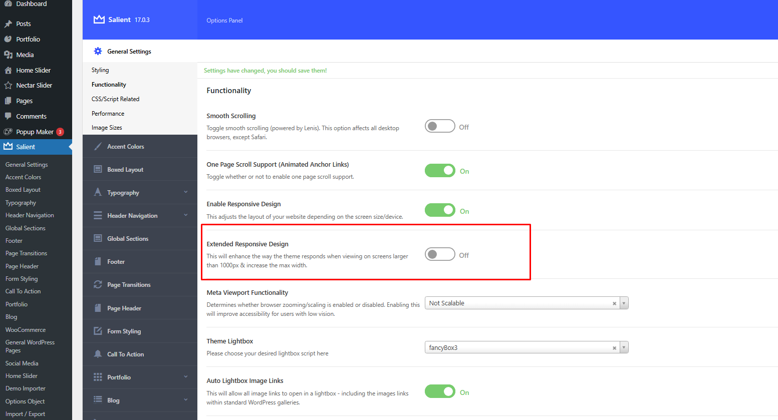 .
.
Also the Container Max width can be reduced to 1200px using Custom CSS as well.
Add this into the Custom CSS box in your Salient Theme Options panel (We write all Custom CSS in the Live Browser to ensure accuracy. If you cannot see any changes, make sure there is no red cross in the Custom CSS Box as any syntax error would cause all CSS under that line of code to not show up on the Frontend):
@media only screen and (min-width: 1000px) {
    .container, body[data-header-format="left-header"] .container, .woocommerce-tabs .full-width-content .tab-container, .nectar-recent-posts-slider .flickity-page-dots, .post-area.standard-minimal.full-width-content .post .inner-wrap, .material #search-outer #search {
        max-width: 1200px !important;
    }
}
Thanks
Salient Support Team
Thank you!
Also note I am an idiot and didn't register that only a small part of the design is narrower so I handled it with padding on those sections.
But this is good info moving forward anyway, have a great day!