i integrated the client logos in my old website. Technically it was just one image with logo tile. Have a look at the screenshot in the attachment?
it would be nice to habe a table with 4 columns for desktop and 2 columns for smartphones. The logo images inside should be poportinal scaled to the width of the columns. Just images no hover or clickable
How can i realize that? Can i build it wiht collumns and raws and integrate image elements or the is an grid element? Do you have a hint for me?
We can try using custom CSS to adjust the width of the client logos for mobile and tablet screens. Please share the URL of the page with the client logos so we can advise.
Unfortunately i do not have the option "Responsive Options" in the dialog box. Have a look in the attachement. Is there still a global setting that i missed to turn on? Thank you All the bests, Daniel
Hi Austin, sorry that i comes up again with some questions. I found the setting, but the archictecture is a little bit confusing for me. My goal would be to show the logos in 6 columns, on smartphone in 3 columns layout. They should stay in an alphabetical order like i insert it
Now i found two ways to layout it and not sure which one is the right. 1. I build a colum element with 6 columns. And placed in every column the logos as image. That would sort on mobile not in alphabetical order
2. I build a column element with 6 colums and the responsive options. I build in it a row element with 6 columns (Confusing, now i have here column setting again, but no repsonive options).
3. The responsive setting. I don't understand how to use it in this case. The setting 12 columns uses the whole width. In my case i would say desktop i need 6 columns, mobile 3 columns. But instead of that on smartphone it just halved the viewport with what is unfortunately not helpful.
I put some screenshots in the attachment.
Do you have a hint for my how to handle that? Thank you a lot.
To have three columns on mobile, you will need to set each column to have a width of 1/4- 3 columns. Please remember you have to do this for each column so you can get the layout you want.
Hello,
i integrated the client logos in my old website. Technically it was just one image with logo tile. Have a look at the screenshot in the attachment?
it would be nice to habe a table with 4 columns for desktop and 2 columns for smartphones. The logo images inside should be poportinal scaled to the width of the columns. Just images no hover or clickable
How can i realize that? Can i build it wiht collumns and raws and integrate image elements or the is an grid element? Do you have a hint for me?
Thank you
All the bests,
Daniel
Attached files: Bildschirmfoto 2025-08-10 um 08.30.30.png
Hi Daniel,
Thank you for getting back to us.
We can try using custom CSS to adjust the width of the client logos for mobile and tablet screens. Please share the URL of the page with the client logos so we can advise.
Alternatively, you can use the rows and columns to add the logos to as a grid. You can adjust the column width for mobile and tablets, like in our guide https://themenectar.com/docs/salient/page-builder-columns/#width.
I hope that helps. We look forward to your reply.
Thanks,
Thank you Austin for your quick answer.
Unfortunately i do not have the option "Responsive Options" in the dialog box. Have a look in the attachement. Is there still a global setting that i missed to turn on? Thank you
All the bests, Daniel
Attached files: Bildschirmfoto 2025-08-11 um 21.18.37.png
Hi Daniel,
Thank you for getting back to us.
You can find this option in the column settings and not the row settings. You will have to adjust this for each column.
I hope that helps.
Cheers,
Hi Austin, sorry that i comes up again with some questions. I found the setting, but the archictecture is a little bit confusing for me. My goal would be to show the logos in 6 columns, on smartphone in 3 columns layout. They should stay in an alphabetical order like i insert it
Now i found two ways to layout it and not sure which one is the right.
1. I build a colum element with 6 columns. And placed in every column the logos as image. That would sort on mobile not in alphabetical order
2. I build a column element with 6 colums and the responsive options. I build in it a row element with 6 columns (Confusing, now i have here column setting again, but no repsonive options).
3. The responsive setting. I don't understand how to use it in this case. The setting 12 columns uses the whole width.
In my case i would say desktop i need 6 columns, mobile 3 columns. But instead of that on smartphone it just halved the viewport with what is unfortunately not helpful.
I put some screenshots in the attachment.
Do you have a hint for my how to handle that?
Thank you a lot.
All the bests, Daniel
Attached files: Version2.png
ResponsiveSetting.png
Version1.png
Bildschirmfoto 2025-08-12 um 07.31.31.png
Hi Daniel,
Thank you for getting back to us.
To have three columns on mobile, you will need to set each column to have a width of 1/4- 3 columns. Please remember you have to do this for each column so you can get the layout you want.
I hope that helps.
Kind regards,
Hi Again,
Thanks for following through.
Regarding your question:
Try using the "Client Display" Page Element. See screenshot: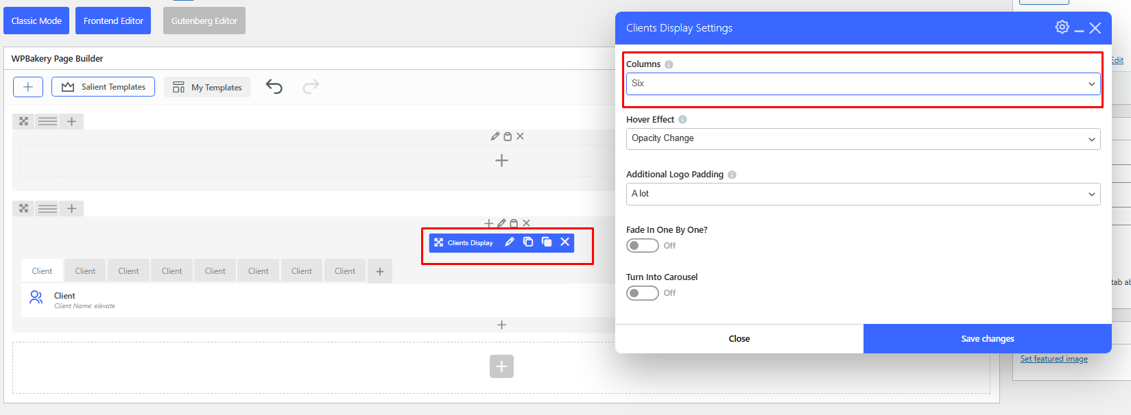
Best,
Salient Support Team