My site has been using MediaGrid plugin for gallery and lightbox. There are some things I don't like about the plugin and I am looking for alternatives. I'm trying out Salient's lightbox, so far only on one page (the URL listed above), and it looks good except for one thing: in the gallery the images are a good size but when the lightbox opens the images are the same size as in the gallery. I want the gallery images to be smaller and function like thumbnails and when the lightbox opens the images should be larger. Is this something I can address in the Image Gallery settings or is it related to the image size in the Media Library?
These are the current image gallery settings for the above URL:
Gallery type: Image Grid Style,
Image size: full,
Masonry Style: on
My website is used it to display the inventory for an art gallery so the images and how they are displayed are critically important.
Thank you. I tried what you suggested but I think it looks better with 4 Columns rather than Fullwidth. I solved the problem of the images appearing too small in the lightbox by adjusting the image size in the media library.
I do like how everything is looking on the computer, but when viewed on a phone the images in the Image Gallery are way too big, all in one vertically stacked column rather than a grid of small images, and when the lightbox opens the image is the same size as in the image gallery. Is there a way I can fix this to have optimal viewing experience on both the computer and the phone?
You can use the below CSS to set the gallery to two column on mobile
@media only screen and (min-width: 0px) and (max-width: 999px) {
    html body .portfolio-items:not(.carousel) .col.span_4, .portfolio-items:not(.carousel) .col.span_3 {
        width: 49.9% !important;
    }
}
Okay, that is working, thanks. One last thing regarding lightbox text size: Is there a way to make the text smaller for mobile viewing? Currently the text is too large and it covers a good portion of the lower part of the image. On computer screen the text size looks fine as is. I inserted the following CSS to make the text the desired size for computer viewing:
.fancybox-caption { font-size: 22px !important; }
I have the image gallery style set to Meta on hover w/zoom + entire thumb link.
Add this into the Custom CSS box in your Salient Theme Options panel (We write all Custom CSS in the Live Browser to ensure accuracy. If you cannot see any changes, make sure there is no red cross in the Custom CSS Box as any syntax error would cause all CSS under that line of code to not show up on the Frontend):
@media only screen and (min-width: 1px) and (max-width: 999px) {
    .fancybox-caption {
        font-size: 16px !important;
    }
}
My site has been using MediaGrid plugin for gallery and lightbox. There are some things I don't like about the plugin and I am looking for alternatives. I'm trying out Salient's lightbox, so far only on one page (the URL listed above), and it looks good except for one thing: in the gallery the images are a good size but when the lightbox opens the images are the same size as in the gallery. I want the gallery images to be smaller and function like thumbnails and when the lightbox opens the images should be larger. Is this something I can address in the Image Gallery settings or is it related to the image size in the Media Library?
These are the current image gallery settings for the above URL:
Gallery type: Image Grid Style,
Image size: full,
Masonry Style: on
My website is used it to display the inventory for an art gallery so the images and how they are displayed are critically important.
Hi Again,
Thanks for reaching out! .
Try using the "Fullwidth" or "Constrained Fullwidth" layout and it should behave as expected: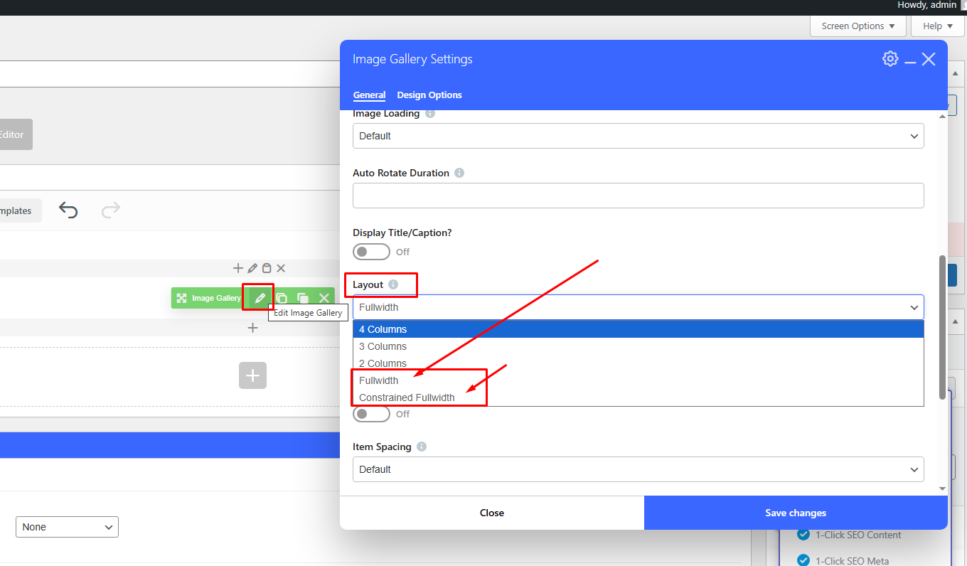
Best,
Salient Support Team
Thank you. I tried what you suggested but I think it looks better with 4 Columns rather than Fullwidth. I solved the problem of the images appearing too small in the lightbox by adjusting the image size in the media library.
I do like how everything is looking on the computer, but when viewed on a phone the images in the Image Gallery are way too big, all in one vertically stacked column rather than a grid of small images, and when the lightbox opens the image is the same size as in the image gallery. Is there a way I can fix this to have optimal viewing experience on both the computer and the phone?
Hi Again,
You can use the below CSS to set the gallery to two column on mobile
@media only screen and (min-width: 0px) and (max-width: 999px) { html body .portfolio-items:not(.carousel) .col.span_4, .portfolio-items:not(.carousel) .col.span_3 { width: 49.9% !important; } }Thanks
Salient Support Team
Okay, that is working, thanks. One last thing regarding lightbox text size: Is there a way to make the text smaller for mobile viewing? Currently the text is too large and it covers a good portion of the lower part of the image. On computer screen the text size looks fine as is. I inserted the following CSS to make the text the desired size for computer viewing:
.fancybox-caption {
font-size: 22px !important;
}
I have the image gallery style set to Meta on hover w/zoom + entire thumb link.
Thank you.
Add this into the Custom CSS box in your Salient Theme Options panel (We write all Custom CSS in the Live Browser to ensure accuracy. If you cannot see any changes, make sure there is no red cross in the Custom CSS Box as any syntax error would cause all CSS under that line of code to not show up on the Frontend):
@media only screen and (min-width: 1px) and (max-width: 999px) { .fancybox-caption { font-size: 16px !important; } }Thanks
Salient Support Team
Thank you so much. My site is looking the way that I want it to!