My website (withfeeling.com) is showing an issue on iPhone where the page can be scrolled horizontally to the right, revealing a large area of blank space. This shouldn’t exist, and it looks like something on the page is breaking the mobile viewport width.
The site works normally on desktop and Android. The problem only appears on iOS Safari.
I’ve attached screenshots so you can see how far the page extends to the right. Nothing on the site should be wider than the screen, so something in the layout is overflowing.
Could you please advise what might be causing this and how to fix it? The site is using the Salient theme with standard settings.
Hi team,
My website (withfeeling.com) is showing an issue on iPhone where the page can be scrolled horizontally to the right, revealing a large area of blank space. This shouldn’t exist, and it looks like something on the page is breaking the mobile viewport width.
The site works normally on desktop and Android. The problem only appears on iOS Safari.
I’ve attached screenshots so you can see how far the page extends to the right. Nothing on the site should be wider than the screen, so something in the layout is overflowing.
Could you please advise what might be causing this and how to fix it? The site is using the Salient theme with standard settings.
Happy to provide access if required.
Thanks!
Hi Again,
Thanks for reaching out! .
Try setting the Row overflow to hidden for this Row: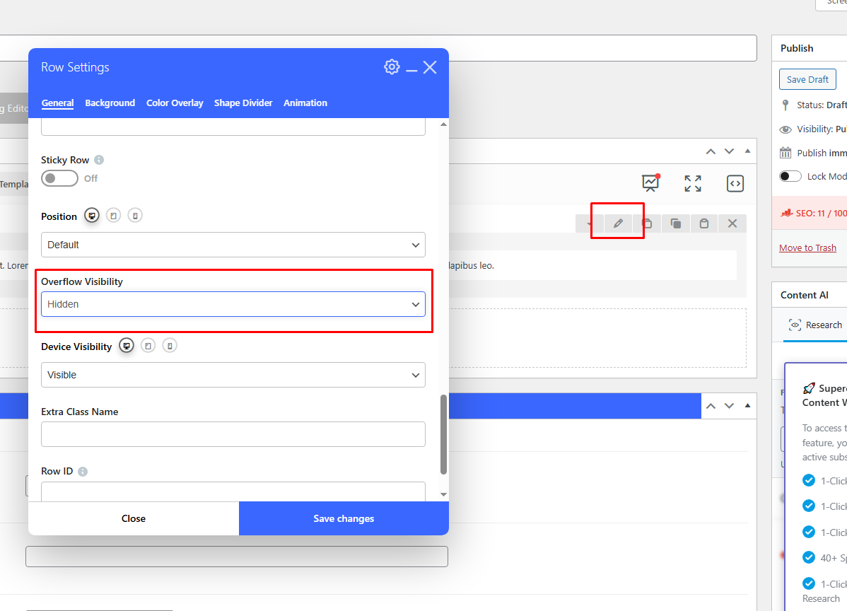
Best,
Salient Support Team
Thank you!! Perfect!