Add this into the Custom CSS box in your Salient Theme Options panel (We write all Custom CSS in the Live Browser to ensure accuracy. If you cannot see any changes, make sure there is no red cross in the Custom CSS Box as any syntax error would cause all CSS under that line of code to not show up on the Frontend):
@media only screen and (min-width: 1px) and (max-width: 999px) {
    .nectar-sticky-media-sections.type--scroll-pinned-sections .nectar-sticky-media-section__content-section {
        position: relative !important;
        top: 0px !important;
    }

    .nectar-sticky-media-section__content-section {
        border: none !important;
    }
}
Tried that, it does "unstick" the pinned effect, but the content is still limited by the viewport height and cut off - so it doesn't scroll the content like a normal section (especially visible in horizontal mobile view - check that to see what I mean)
I can try a workaround like duplicating the inner rows and hiding the content to show it only on mobile and tablet in normal rows, but that's not workable due to the SEO duplication that search engines will see etc.
Add this into the Custom CSS box in your Salient Theme Options panel (We write all Custom CSS in the Live Browser to ensure accuracy. If you cannot see any changes, make sure there is no red cross in the Custom CSS Box as any syntax error would cause all CSS under that line of code to not show up on the Frontend):
@media only screen and (min-width: 1px) and (max-width: 999px) {
    .nectar-sticky-media-sections.type--scroll-pinned-sections .nectar-sticky-media-section__content-section {
        position: relative !important;
        top: 0px !important;
        height: auto !important;
    }

    .nectar-sticky-media-section__content-section {
        border: none !important;
    }
}
Hey, I'm using the 'sticky scrolled pinned sections' (similar to this section: https://themenectar.com/salient/tether/#features) and have content cutting off on mobile and tablet.
Is there a way to unpin this element below 999px wide, to just stack the content normally below — no cropping, no vh limit etc.?
Thanks!
Hi Again,
Thanks for reaching out! .
Try adjusting these fields for the Mobile and Tablet viewport and check: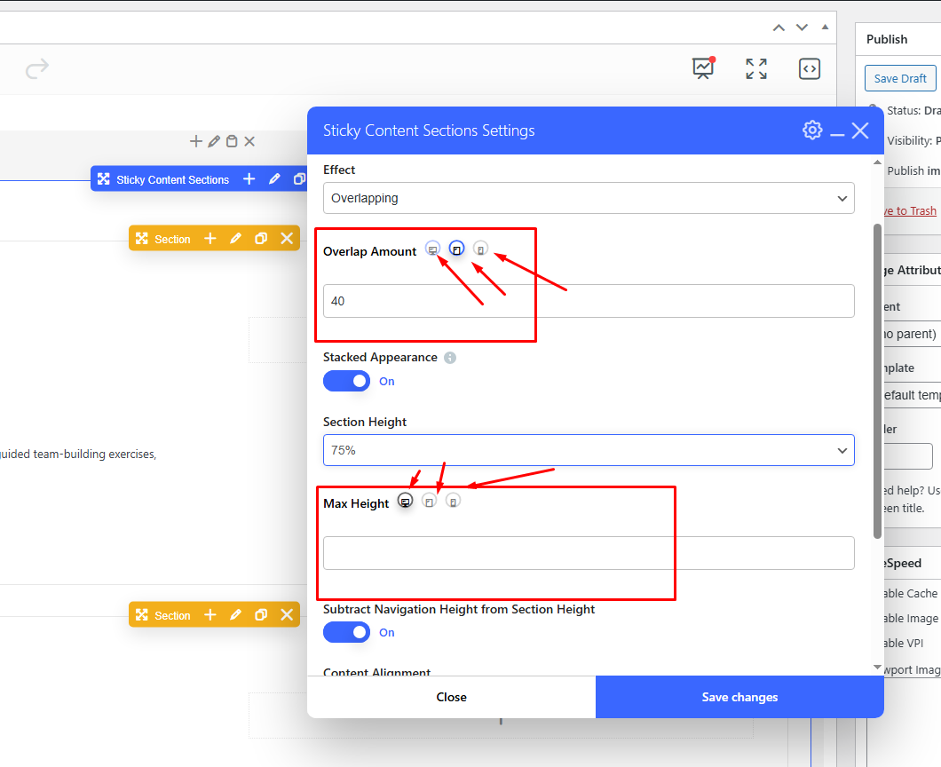
Best,
Salient Support Team
Thanks Tahir,
Yes did try that and now again with huge pixel, % or vh values for max height and it doesn't do anything - try it yourself.
A big problem is also viewing in mobile horizontal view, the content is mostly cut off.
Any CSS to force it to unpin the sections below 999px?
Add this into the Custom CSS box in your Salient Theme Options panel (We write all Custom CSS in the Live Browser to ensure accuracy. If you cannot see any changes, make sure there is no red cross in the Custom CSS Box as any syntax error would cause all CSS under that line of code to not show up on the Frontend):
@media only screen and (min-width: 1px) and (max-width: 999px) { .nectar-sticky-media-sections.type--scroll-pinned-sections .nectar-sticky-media-section__content-section { position: relative !important; top: 0px !important; } .nectar-sticky-media-section__content-section { border: none !important; } }Thanks
Salient Support Team
Thanks Tahir,
Tried that, it does "unstick" the pinned effect, but the content is still limited by the viewport height and cut off - so it doesn't scroll the content like a normal section (especially visible in horizontal mobile view - check that to see what I mean)
I can try a workaround like duplicating the inner rows and hiding the content to show it only on mobile and tablet in normal rows, but that's not workable due to the SEO duplication that search engines will see etc.
Any other ideas? Thanks!
Hi Again,
Thanks for the details.
Add this into the Custom CSS box in your Salient Theme Options panel (We write all Custom CSS in the Live Browser to ensure accuracy. If you cannot see any changes, make sure there is no red cross in the Custom CSS Box as any syntax error would cause all CSS under that line of code to not show up on the Frontend):
@media only screen and (min-width: 1px) and (max-width: 999px) { .nectar-sticky-media-sections.type--scroll-pinned-sections .nectar-sticky-media-section__content-section { position: relative !important; top: 0px !important; height: auto !important; } .nectar-sticky-media-section__content-section { border: none !important; } }Thanks
Salient Support Team
Thanks Tahir,
Sorted! Much appreciated.