I need your help in adjusting the font type and size for an animated page header. As you know, you can control the typography for desktop via Salient Page Heading Font, but I couldn't find any option for mobile view adjustments. I also tried to use the code below by inserting it in the CSS WP Bakery page builder, but it didn't do anything when viewing the page on mobile.
Thanks for writing in, and I trust you're keeping safe!
I noticed the issue in the code provided.
Your Page Header text is currently wrapped in a paragraph <p> tag with an inline style setting the size to a fixed 35px. This inline code overrides both the theme settings and the custom CSS you were trying to add.
Please use this CSS instead and let me know how it goes:
@media only screen and (max-width: 690px) {
    /* Target the paragraph inside the H1 and force size change */
    body #page-header-bg .span_6 h1 p {
        font-size: 20px !important; /* Adjust size as needed */
        line-height: 28px !important;
    }
}
Thank you for your prompt response. I have tried the CSS before I started messing with HTML in the page head title settings.
So now I've tried inserting the code in the CSS window, but it did not affect the mobile display version. On the same topic, I am trying to have a video background for the main page and control the text size for both Desktop and Mobile. So instead of having a local video, I tried having a YouTube video linked in the row settings to control the fonts of Desktop and Mobile separately, but the issue here is that the video link does not read for mobile. Can you clue me in on this? Much appreciated.
You dont need to add CSS to adjust the title as the first section is build using the Page Builder. Therefore you will have to change the Page element font setting in here:
Hi Tahir, thank you for sharing your insights. I was utilizing a different Hero Section where the header page title can only be modified under the page edit tab. How can I manage that specifically for mobile? It would be perfect if you could add that font control to all types of text blocks. For example, the text rotation feature does not offer font size control for mobile devices.
Additionally, could you clarify why a video background cannot utilize a YouTube link? Why is it necessary for the video to be local in order for it to function on the mobile version? It works only for desktop view, but the mobile view will only show a background or image.
Hello Support Team,
I need your help in adjusting the font type and size for an animated page header. As you know, you can control the typography for desktop via Salient Page Heading Font, but I couldn't find any option for mobile view adjustments. I also tried to use the code below by inserting it in the CSS WP Bakery page builder, but it didn't do anything when viewing the page on mobile.
@media only screen and (max-width: 690px) {
#page-header-bg .span_6 h1, .single.single-post .section-title h1 {
letter-spacing:0px !important;
}
body #page-header-bg .span_6 span.subheader {
letter-spacing: 0px !important;
}
}
Hello Waeel,
Thanks for writing in, and I trust you're keeping safe!
I noticed the issue in the code provided.
Your Page Header text is currently wrapped in a paragraph <p> tag with an inline style setting the size to a fixed 35px. This inline code overrides both the theme settings and the custom CSS you were trying to add.
Please use this CSS instead and let me know how it goes:
@media only screen and (max-width: 690px) { /* Target the paragraph inside the H1 and force size change */ body #page-header-bg .span_6 h1 p { font-size: 20px !important; /* Adjust size as needed */ line-height: 28px !important; } }Best wishes,
Salient Theme Support
Hi Pat,
Thank you for your prompt response. I have tried the CSS before I started messing with HTML in the page head title settings.
So now I've tried inserting the code in the CSS window, but it did not affect the mobile display version. On the same topic, I am trying to have a video background for the main page and control the text size for both Desktop and Mobile. So instead of having a local video, I tried having a YouTube video linked in the row settings to control the fonts of Desktop and Mobile separately, but the issue here is that the video link does not read for mobile. Can you clue me in on this? Much appreciated.
Attached files: Screenshot 2025-12-15 122858.png
Screenshot 2025-12-15 122803.png
Hi Again,
Thanks for reaching out! .
You dont need to add CSS to adjust the title as the first section is build using the Page Builder. Therefore you will have to change the Page element font setting in here: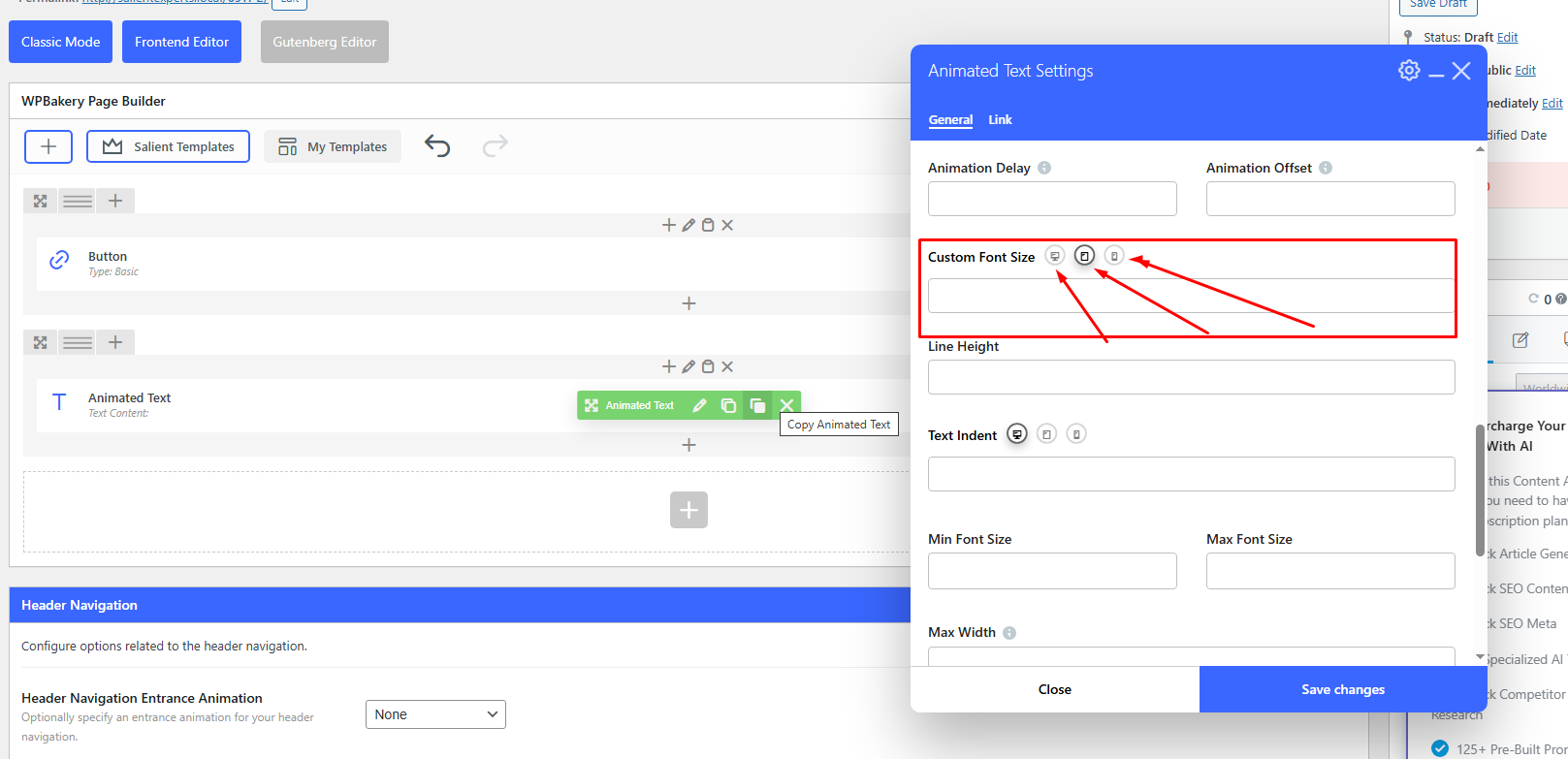
Best,
Salient Support Team
Hi Tahir, thank you for sharing your insights. I was utilizing a different Hero Section where the header page title can only be modified under the page edit tab. How can I manage that specifically for mobile? It would be perfect if you could add that font control to all types of text blocks. For example, the text rotation feature does not offer font size control for mobile devices.
Additionally, could you clarify why a video background cannot utilize a YouTube link? Why is it necessary for the video to be local in order for it to function on the mobile version? It works only for desktop view, but the mobile view will only show a background or image.
Thanks,