I’m trying to adjust the header size on mobile, but I can’t seem to find where it’s set. I've tried everything. Line height is too tight and so is the typography.
When the line height and font size feel too tight on mobile, it is usually because the Responsive Font Resizing isn't aggressive enough for the specific length of your project title.
You can fix this using the built-in theme options or a targeted CSS snippet.
Target the Portfolio Header via CSS
If you only want to change the header for your portfolio items without affecting the rest of the site, add this to Salient > General Settings > CSS/Script Related > Custom CSS Code:
/* Adjust Page Header Typography for Portfolio Projects on Mobile */
@media only screen and (max-width: 999px) {
    .single-portfolio .row .col.span_12.project-title h1 {
        font-size: 32px !important; /* Adjust size as needed */
        line-height: 1.4 !important; /* Increases the vertical spacing */
        letter-spacing: 0.5px !important;
        margin-bottom: 20px !important;
    }

    /* Adjust the subtitle/excerpt if it also feels too tight */
    .single-portfolio .row .col.span_12.project-title p {
        font-size: 16px !important;
        line-height: 1.6 !important;
    }
}
NB: We've included comments in the code for your review.
Add this into the Custom CSS box in your Salient Theme Options panel (We write all Custom CSS in the Live Browser to ensure accuracy. If you cannot see any changes, make sure there is no red cross in the Custom CSS Box as any syntax error would cause all CSS under that line of code to not show up on the Frontend):
@media only screen and (max-width: 690px) {
    body.single-portfolio .row .col.section-title.span_12 h1 {
        line-height: 1.3em !important;
    }
}
Hello Cameron,
Thanks for writing in!
When the line height and font size feel too tight on mobile, it is usually because the Responsive Font Resizing isn't aggressive enough for the specific length of your project title.
You can fix this using the built-in theme options or a targeted CSS snippet.
Target the Portfolio Header via CSSIf you only want to change the header for your portfolio items without affecting the rest of the site, add this to Salient > General Settings > CSS/Script Related > Custom CSS Code:
/* Adjust Page Header Typography for Portfolio Projects on Mobile */ @media only screen and (max-width: 999px) { .single-portfolio .row .col.span_12.project-title h1 { font-size: 32px !important; /* Adjust size as needed */ line-height: 1.4 !important; /* Increases the vertical spacing */ letter-spacing: 0.5px !important; margin-bottom: 20px !important; } /* Adjust the subtitle/excerpt if it also feels too tight */ .single-portfolio .row .col.span_12.project-title p { font-size: 16px !important; line-height: 1.6 !important; } }NB: We've included comments in the code for your review.
For a deeper dive into how Salient handles typography, see the Salient Typography Documentation.
Let us know if this works or you need further assistance.
Best,
Hey there,
Thanks for the code snippet but it seems to still not be working.
Attached files: Screenshot 2026-01-28 at 17.24.31.png
Screenshot 2026-01-28 at 5.24.54 pm.png
Add this into the Custom CSS box in your Salient Theme Options panel (We write all Custom CSS in the Live Browser to ensure accuracy. If you cannot see any changes, make sure there is no red cross in the Custom CSS Box as any syntax error would cause all CSS under that line of code to not show up on the Frontend):
@media only screen and (max-width: 690px) { body.single-portfolio .row .col.section-title.span_12 h1 { line-height: 1.3em !important; } }Thanks
Salient Support Team
Is this more code I need to add to the Custom CSS?
You only need to add the below one to adjust the line height and fix the overlap.
Thanks
Salient Support Team
Really sorry, but its still not working even with just hat small bit of code you recently sent.
I cant seem to view the code provided earlier in the page html source. See screenshot of how the code should work: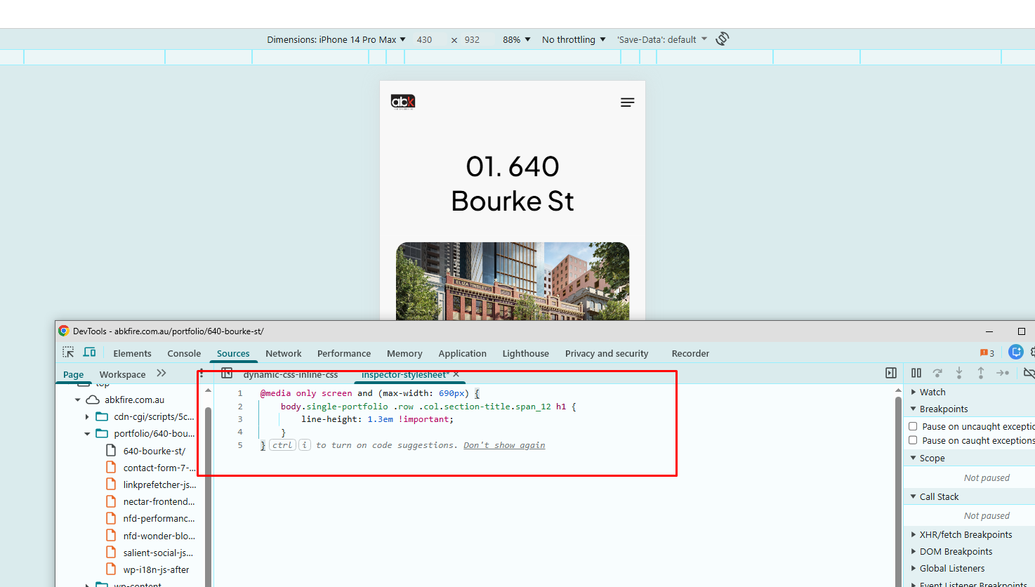
Thanks
Salient Support Team